Max Temperature
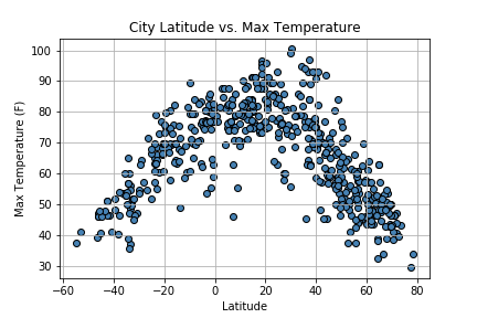
For the Latitude vs Temperature plot, which plots together the latitudes of the data set along with the maximum temperature in the city. It is pretty clear that the cities that have their latitude closer to 0 which means closer to the equator, have the highest maximum temperature. As you move further away from the equator the maximum temperature drops to lower values.
Visualizations